RE-BRAND OF UK’S LARGEST & LONGEST RUNNING TOURING COMPANY.
CARAVAN & MOTORHOME CLUB.
The Caravan Club, Europe’s biggest touring community catering to caravaners, motorhomers and campers across 3000+ locations, were facing a fork in the road. With the multitude of options now open to travellers they were faced with the challenge; update and stay relevant against the myriad of accommodation options now open to travellers or keep the status quo and fade into irrelevance.
ROLE
Design Direction.
Enter Drum, who developed the brand strategy, new values and a new more approachable tone of voice. With these in place I was responsible for establishing a new modern visual identity and language for the brand, including a new logo, colour palette, typography, photography style and a robust and flexible design system. I defined the design strategy and oversaw a team of brand designers to bring it to life.
BRAND CREATION PROCESS.
The project ran over 3 months kicking off with an audit of the brand. What we found was an outdated look and feel that didn’t reflect the aspirations of the brand and lack of coherence across their different touchpoints.
The design strategy was built on the idea the brand had a USP no one else could match:
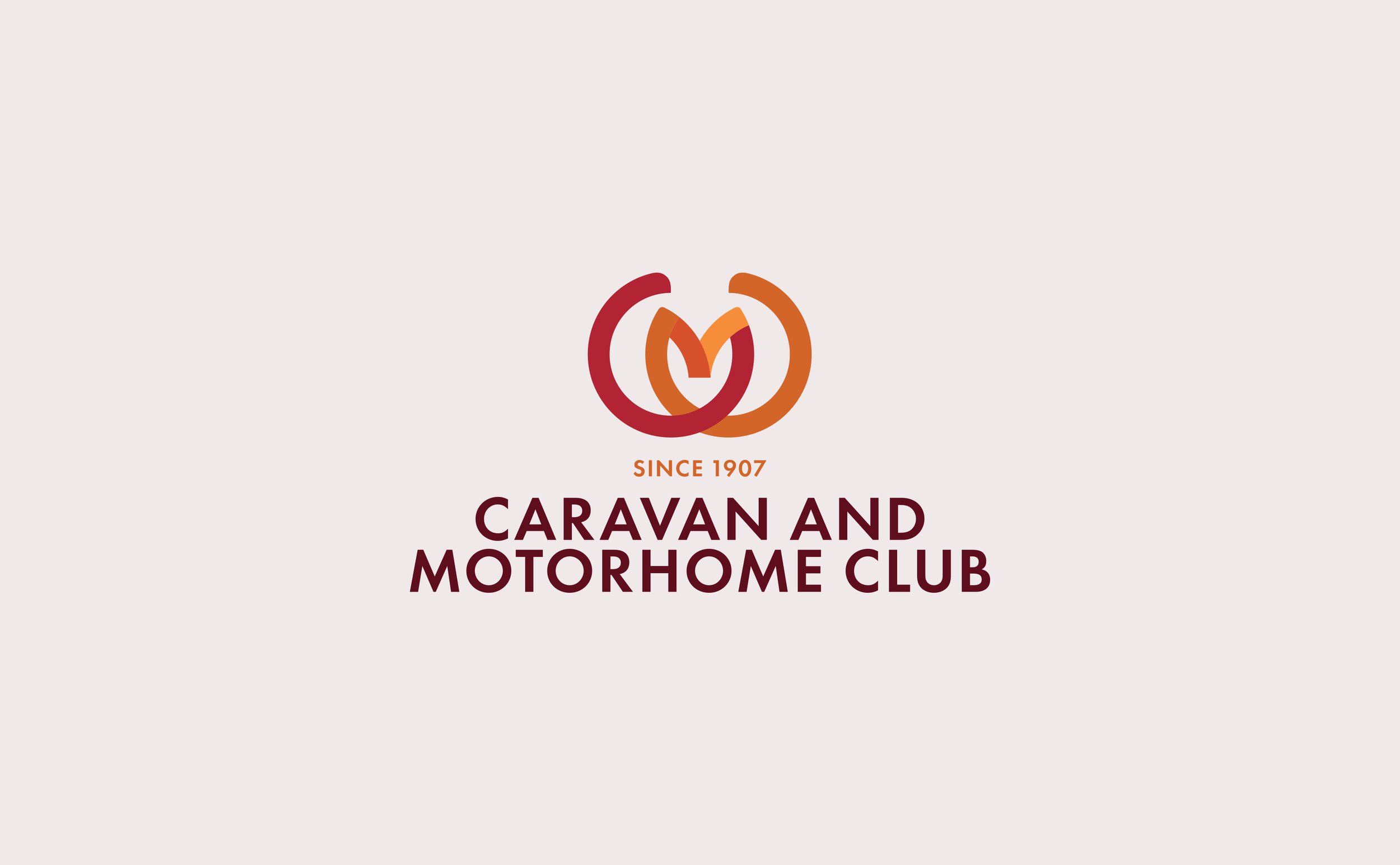
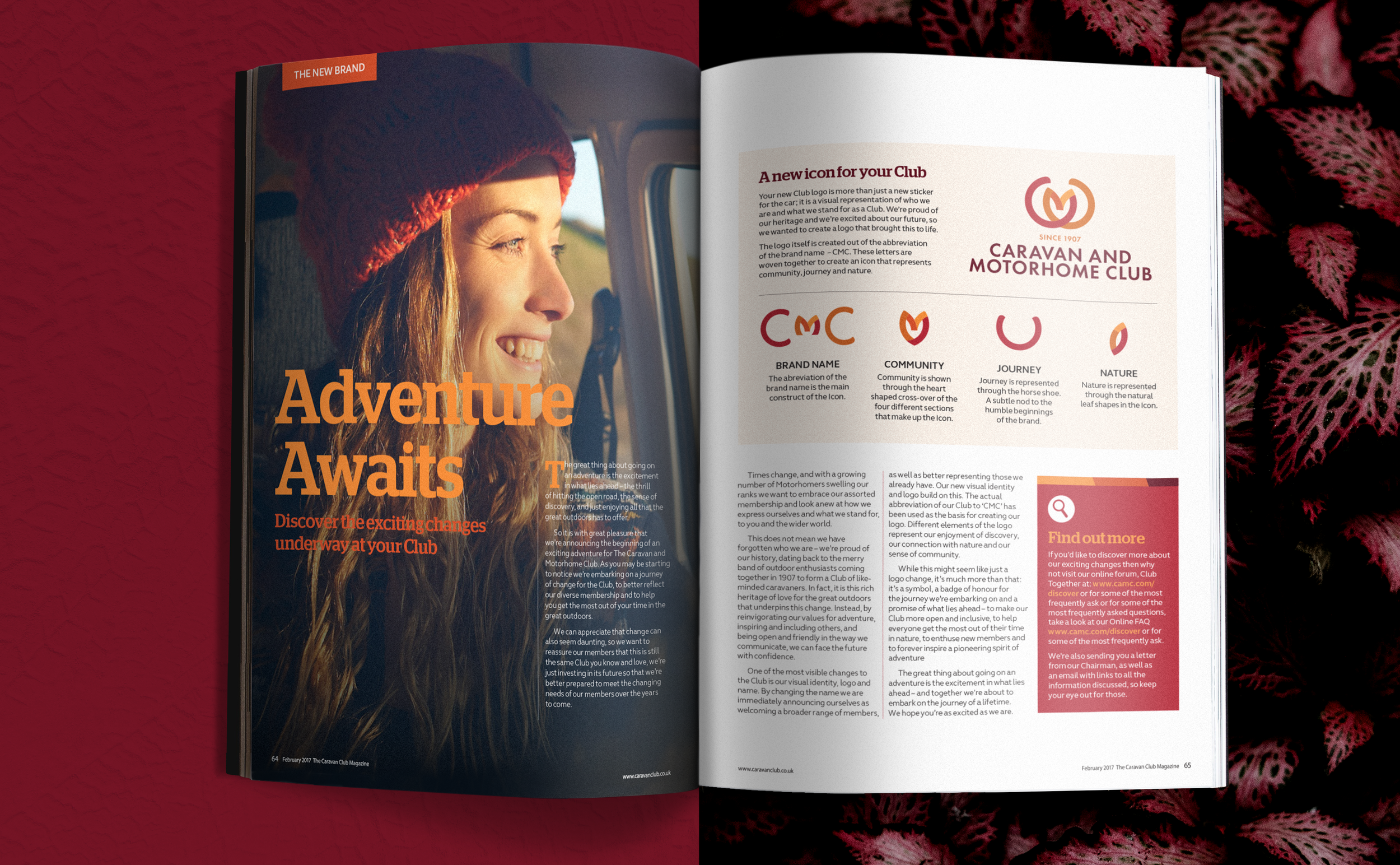
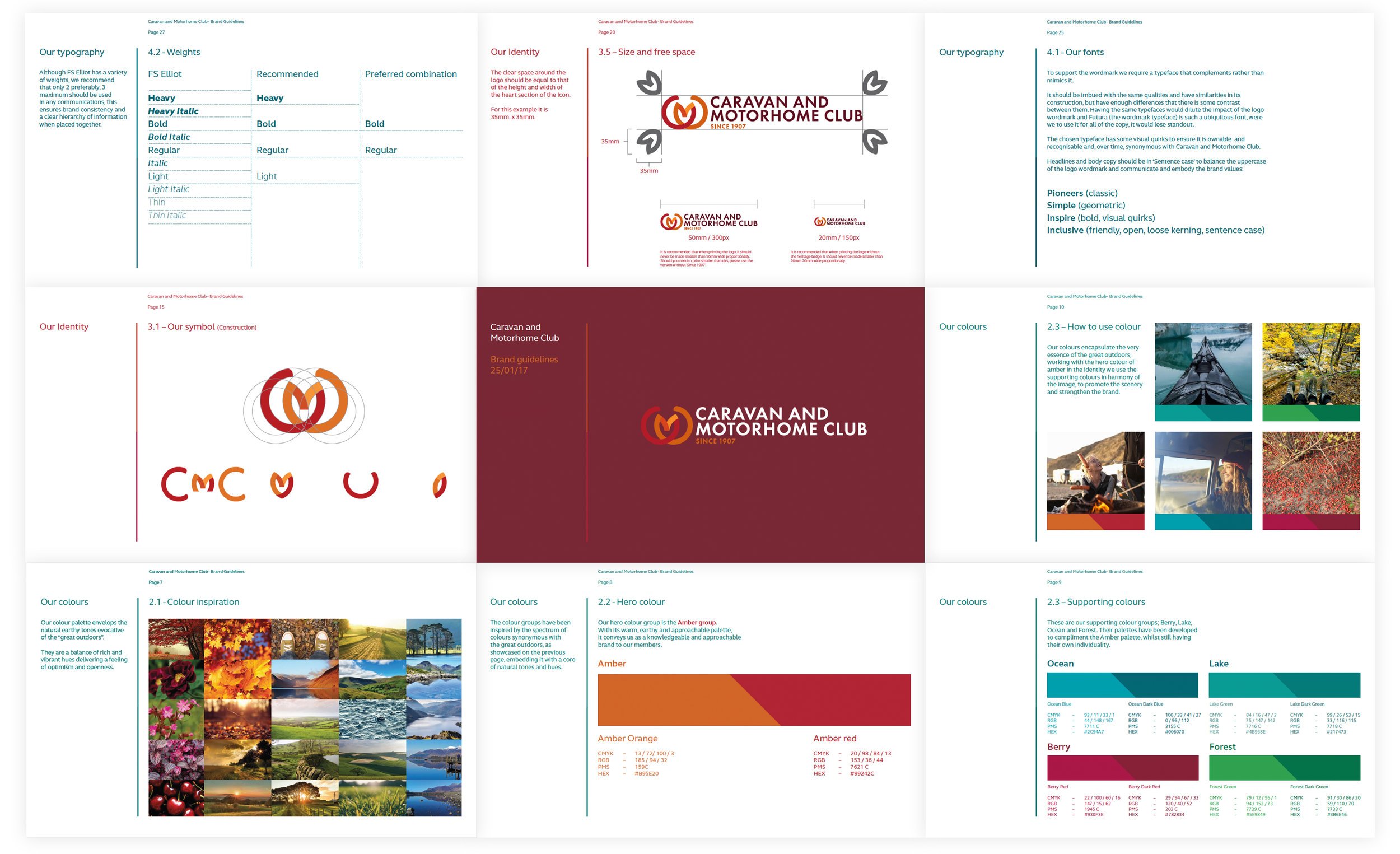
An iconic new marque layered with meaning.
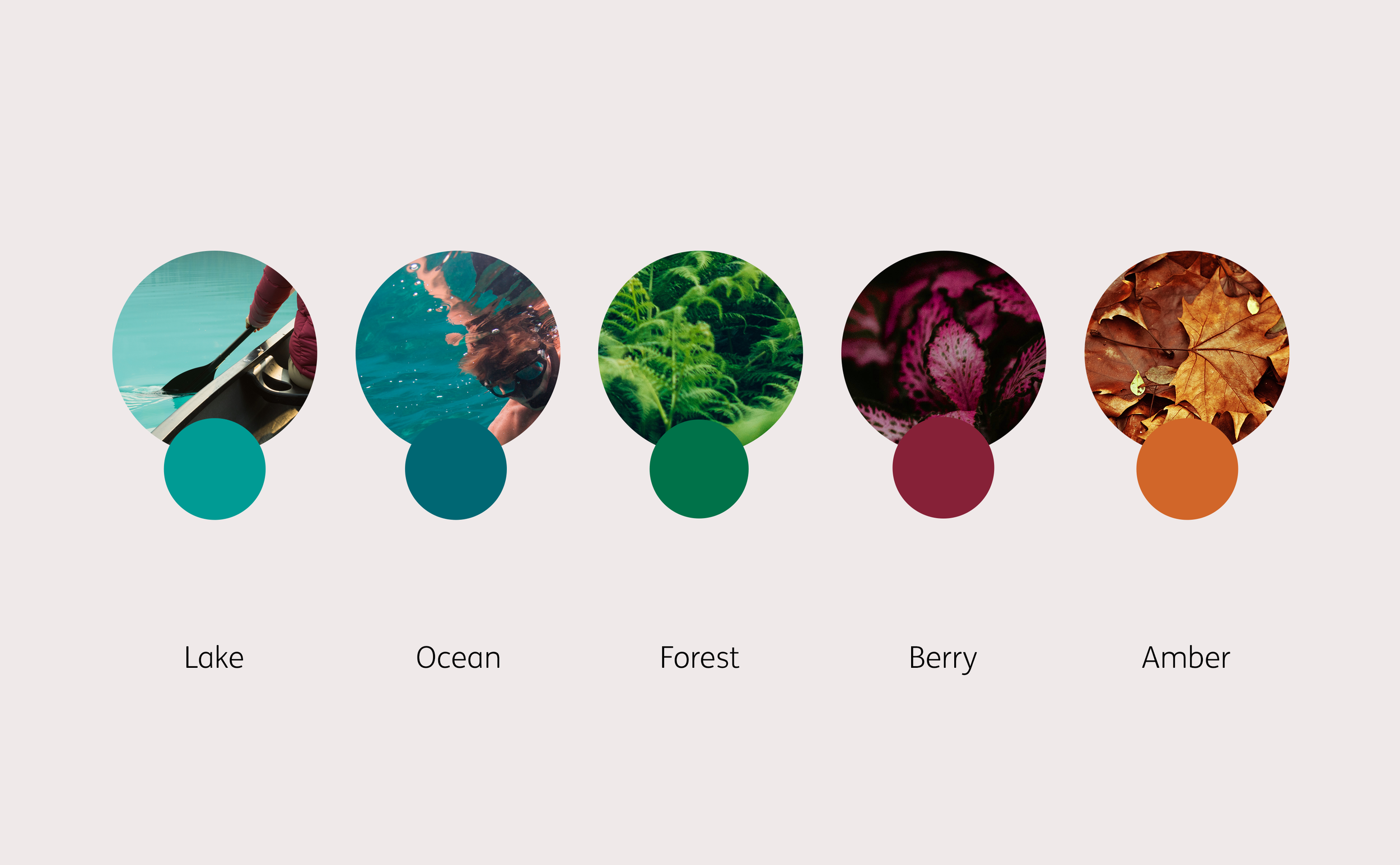
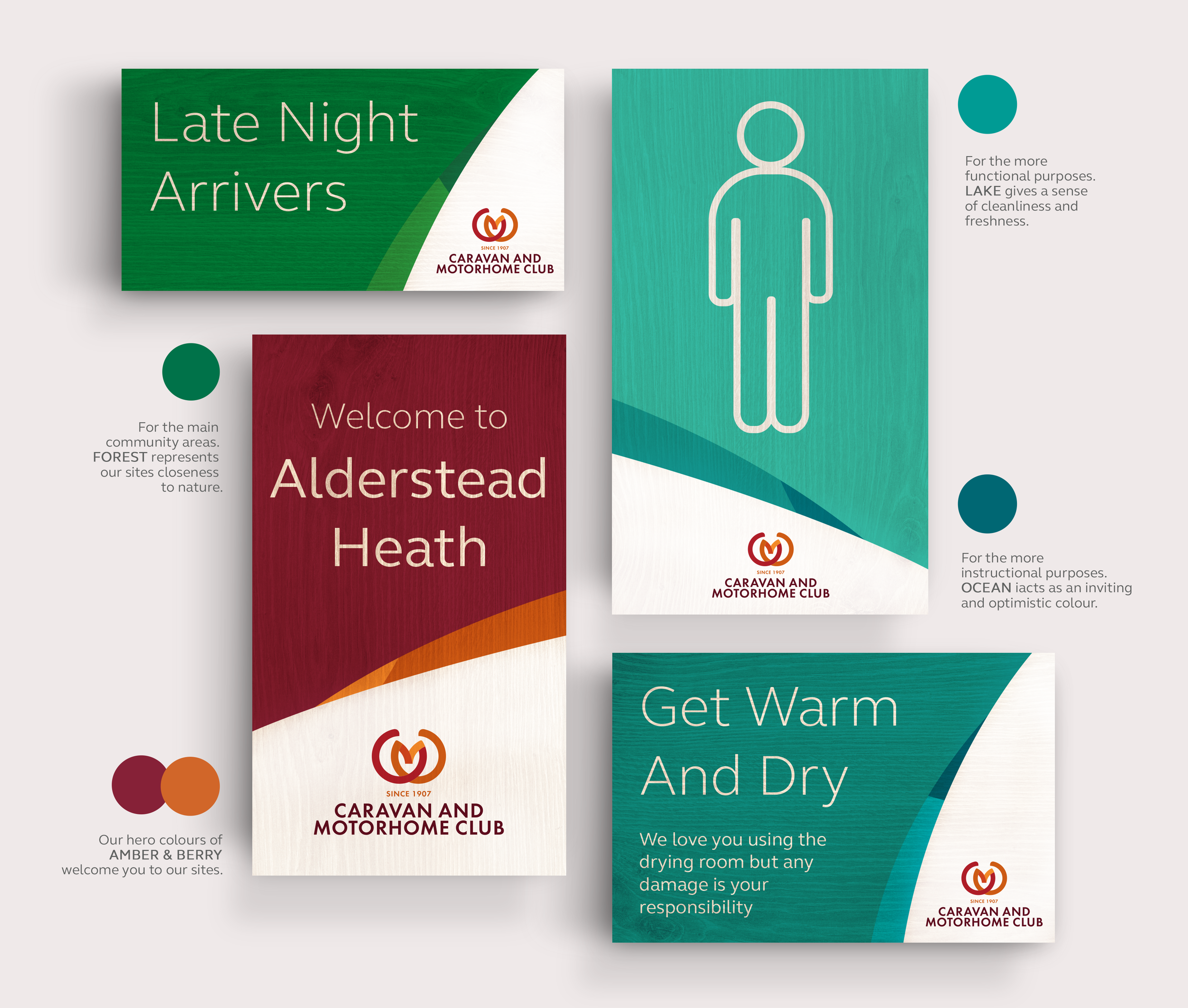
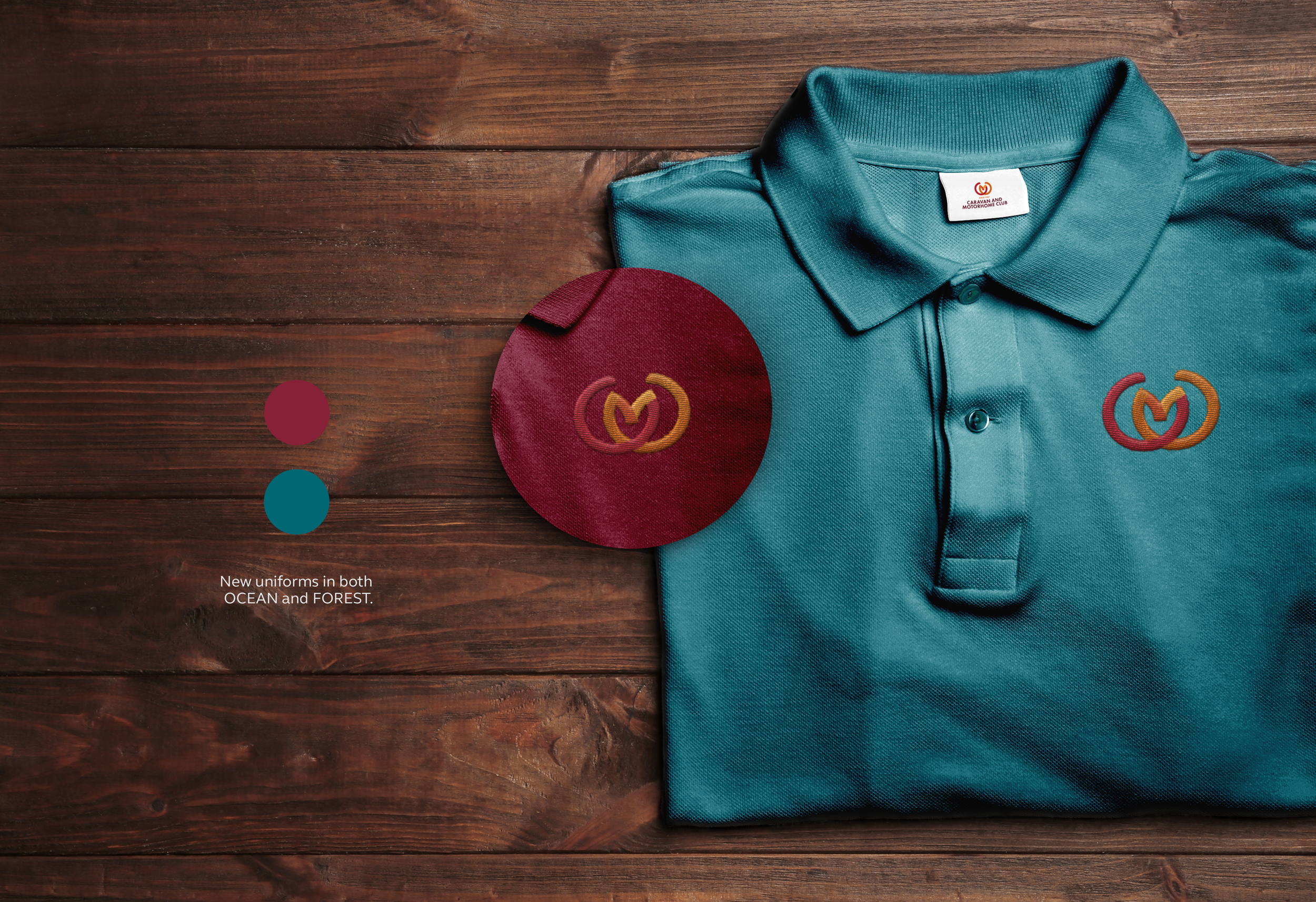
Supported by a colour palette, inspired by nature and that gave a nod to the heritage of the brand.
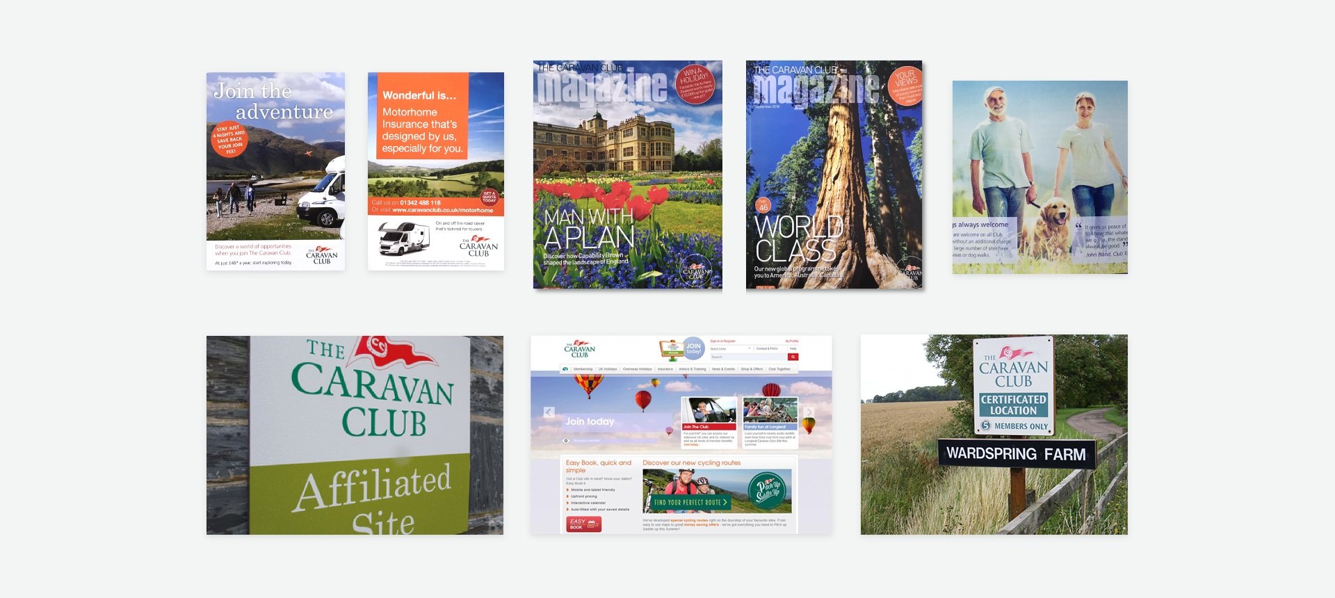
The new look and feel rolled out to publications, merchandise, uniforms & on-site signage and way-finding.
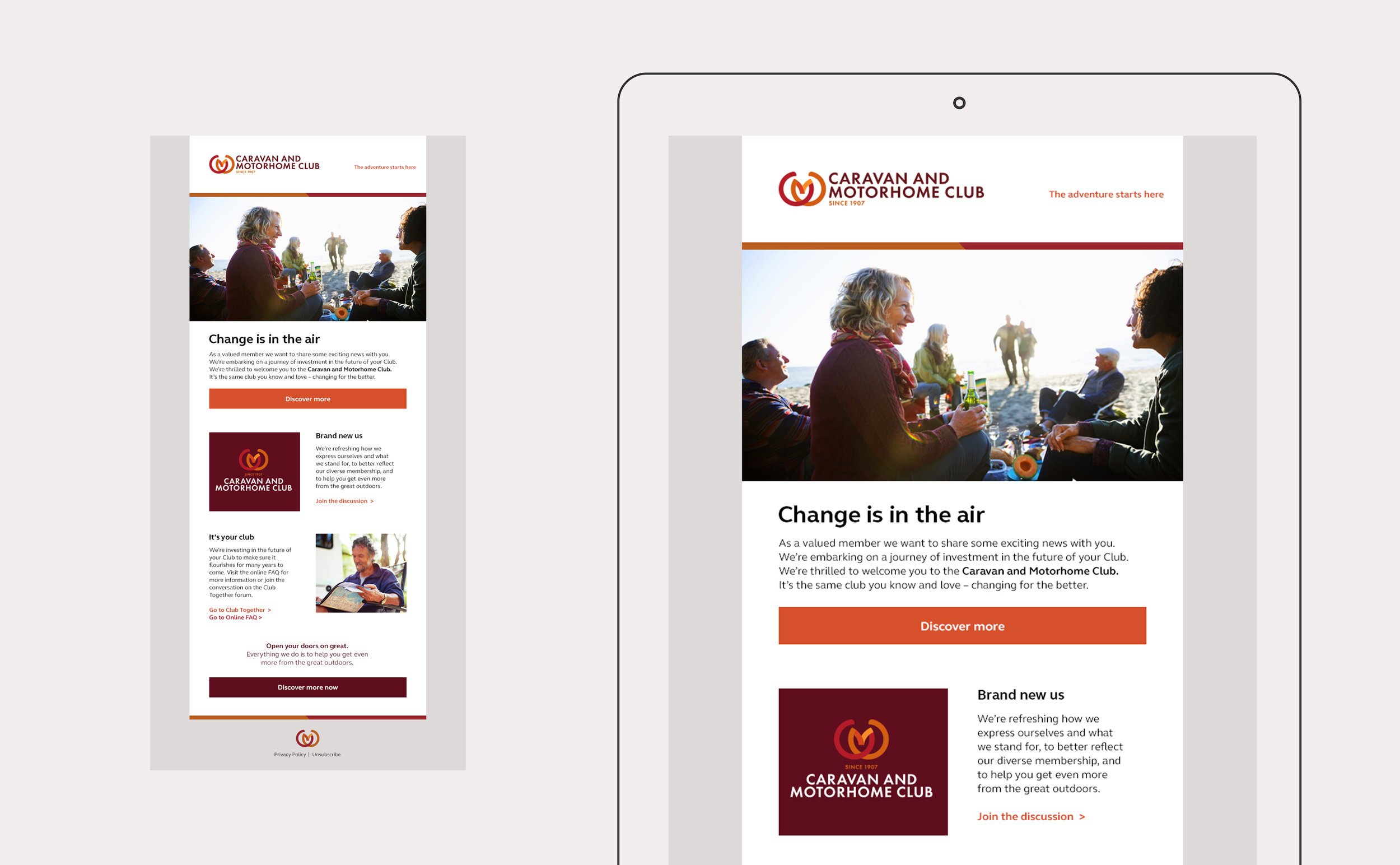
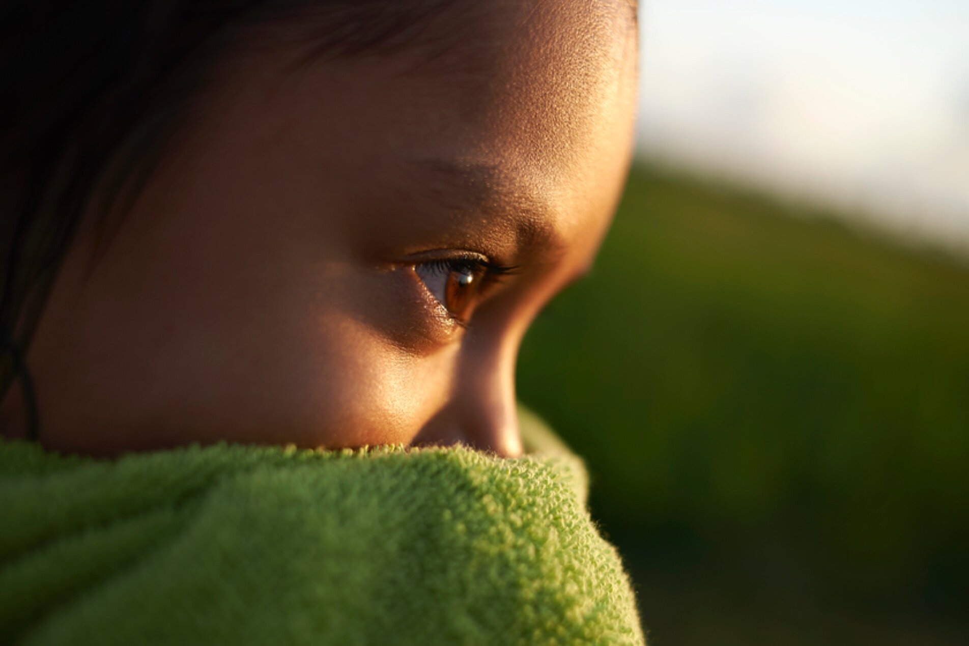
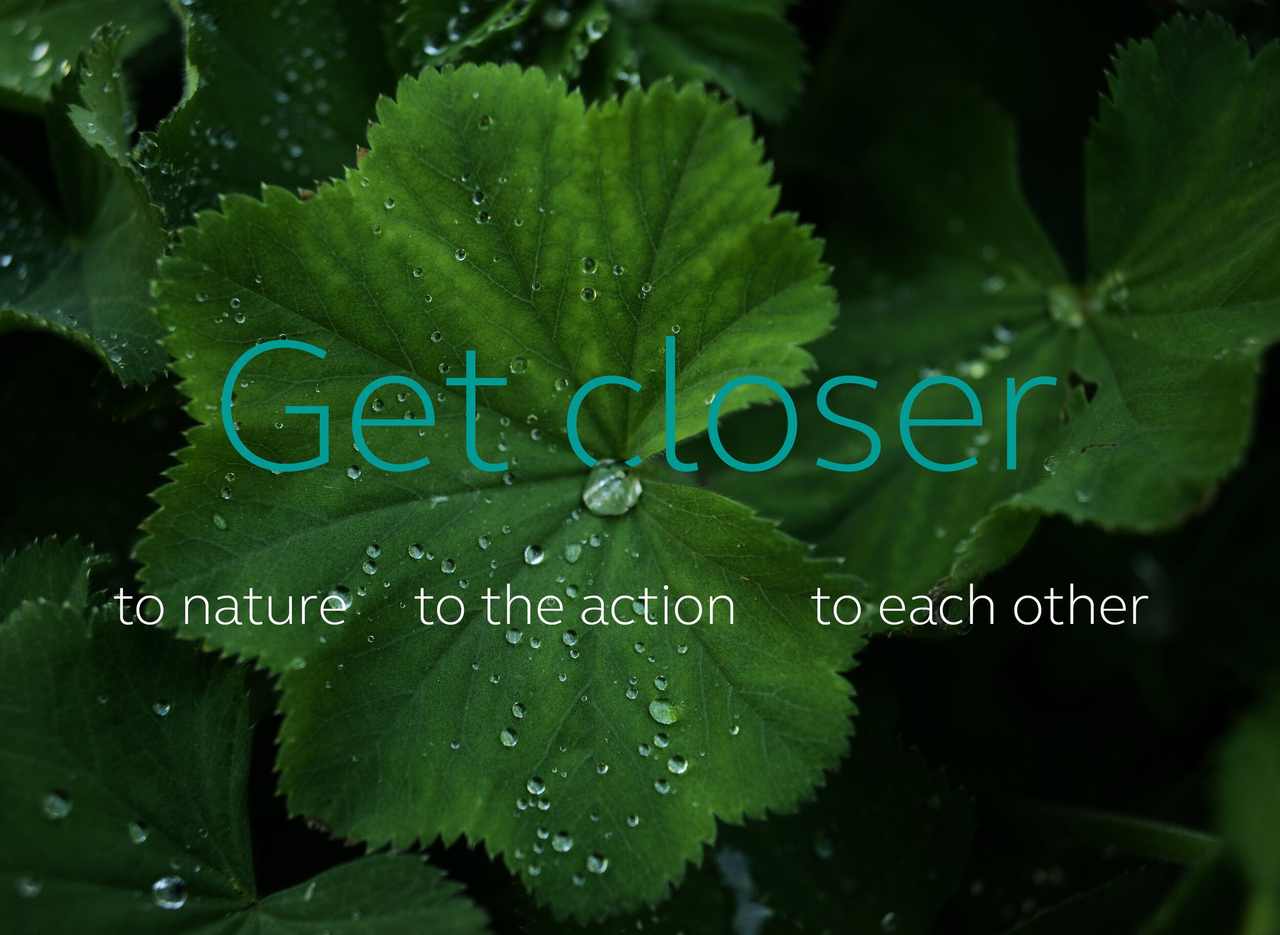
‘Getting closer’ ran through the veins of the wider brand, helping define a new approach to photography that captured both the macro and micro of the traveller experience.
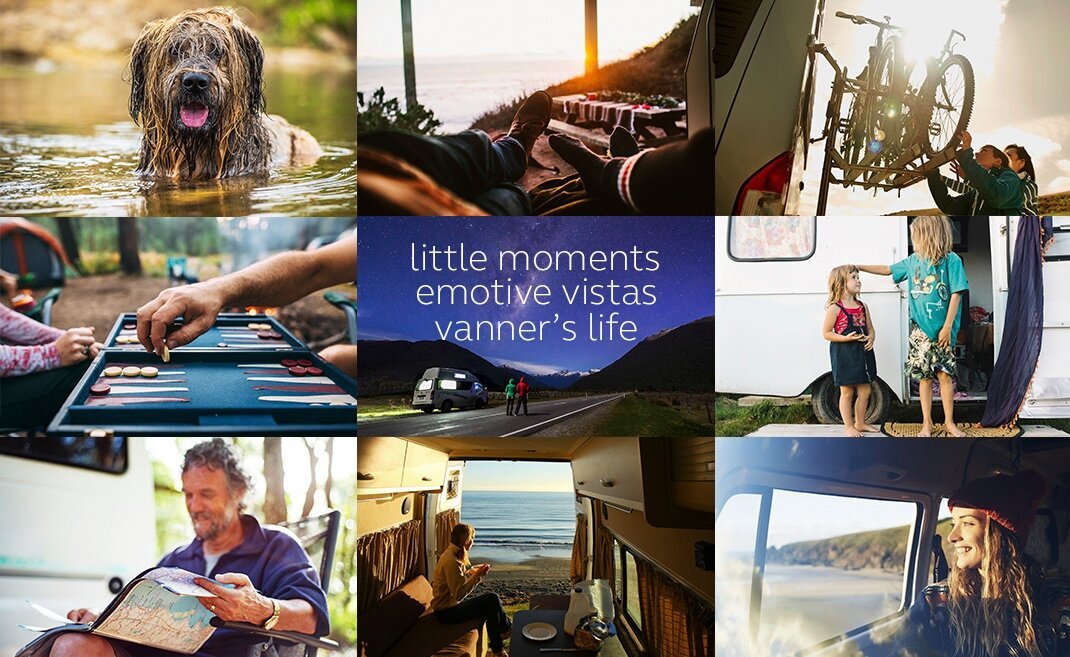
The sights, smells, sounds.
The sound of raindrops
on your tent.
The crunching of leaves beneath your boots.
BRAND GUIDELINES.
The brand package was supported by a set of comprehensive visual and tone of voice guidelines.
BRANDING
DESIGN & ART DIRECTION
DISCIPLINES